

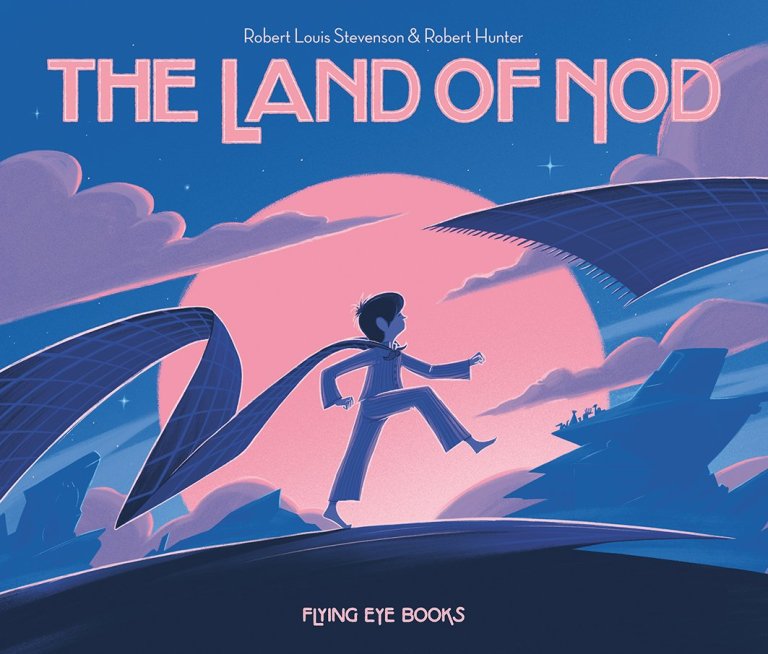
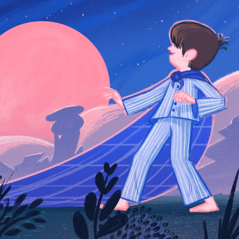
One off the most visually striking picture books of 2016, Robert Hunter’s adaptation of Land of Nod by Robert Louis Stevenson, not only illustrated a much loved poem, but like all good picture books added an entire new dimension. Hunter uses a combination of digital and hand drawn techniques in his work, creating a perfect marriage of the two. Below he explains how he created the Land of Nod from conception through to the final, glorious product.

How did you come to adapt Land of Nod as a picture book?
The project was something that Flying Eye came up with. From my understanding they knew the poem and it occurred to them that it would potentially make a good children’s picture book. They presented the idea to me and I was more than happy to give it a go.
The colours are particularly striking, did you play around with other schemes when you were creating the art?

I had made a few colour tests whilst in the early sketch stage of the project but I was pretty set on it being quite cold. I sometimes try out colours on smaller editorial jobs if the subject matter allows it. This helps me to see how the colours work in a finished image. With Land Of Nod I had done a colour test for book review section illustration for the Guardian. This was my starting point and then when I choose the pantones at the end it always goes a little bit brighter which is the fun surprise at the end.

Could you tell us a bit more about your process?
I usually start with lots of written descriptions about what will be on each page to start piecing the visual narrative together. After several passes of that I will begin to draw very small quick compositions of the pages to try and get the foundations of the image in place and it gives me a good overview of the whole book.

I end up doing this over and over again trying out different options. Once the thumbnail sketches are in place I will scan and place them into a document on my computer that has the correct page measurements and sketch over the top to make a much clearer sketch that I can share with the publishers.


There are usually a few pages changed here and there, but once I have the final set I will begin drawing the final artwork. At this stage I will usually draw neat line work and then use the computer to colour behind the lines. I have a special homemade colour guide that I will have made specifically for the project which will show me all of the possible colours that can be created from the four pantone inks I will have chosen. From the colour guide I select sections of the line work and change the colour of them, which can be a painstaking process on some pages.

After all the artwork is complete I have to separate the colours which means finding out what combination and density of ink makes that particular green of the crocodile and make four separate documents per image for the printers one documents for each ink. It gets very complicated and can take a long time but the end result is always worth it because the inks will be so much brighter than conventional printing.

I was reminded of Disney artist Eyvind Earle’s work. Who were your inspirations for this book?
I am very flattered, I love Eyvind Earle’s work, I definitely had him in mind whilst searching for inspiration. Winsor McCay’s little Nemo in Slumberland helped me to make the whole thing a lot weirder.

I had a folder on my computer with a selection of old eastern European children’s book illustrations and paintings. I printed out a few big sheets with all my inspiration which I kept it in sight whilst I sketched the pages.

Robert Louis Stevenson’s poem ends on a rather melancholy note, with a suggestion that the land of Nod is more appealing than the world of waking. Your ending is rather more hopeful I think – why did you make this decision?
There were several versions of this book at the sketch stage with different endings. We did decide that the melancholy feeling could be due to a restriction in the boys real life so that when he wakes and sees that what he is longing for isn’t completely out of reach that it gave the book a nice dynamic. Other versions felt like they stayed on the same plane and when and by the end it didn’t feel any different to the start. But it was a tricky thing to decide on especially when interpreting such a great text, I didn’t want to go completely off piste.

Do you have plans to illustrate more poems in this way?
I don’t have any plans at the moment but would happily do it again. With previous book projects I have started with a selection of books as a source of inspiration and I find that poetry is very useful to help me think about themes and ideas.
The Land of Nod is published by Flying Eye Books.


So lovely to see some of the processes involved in getting to the final image, and fascinating — as always — to see the influences that affected the outcomes. Thanks again for this, Jake.
LikeLike