

I’ve always wanted to join a book club, but with so many unread books already on my shelves and tottering in piles on my side of the bed, having to read someone else’s choice every month as well might just breed resentment, and unfortunate outbursts in front of acquaintances. Plus I’ve got a dreadfully short attention span, so when a friend suggested a club dedicated to books that I could read in an evening it sounded like the perfect solution.
So far we’ve read a gonzo blockbuster, The Auteur and talked about a hipster’s take on the world of Transformers and G.I Joe. This month it was my turn, and after much umming and ahing I plumped for Edgar P. Jacobs’ The Yellow ‘M’. I discovered Jacobs recently, as Hergé’s creative partner on some of his classic Tintin adventures. Always in search of a series that might match up to Tintin, I had high hopes for the Adventures of Blake and Mortimer. But to be polite first let’s hear what fellow comic book club members Tom, Dan and Kelvin thought.
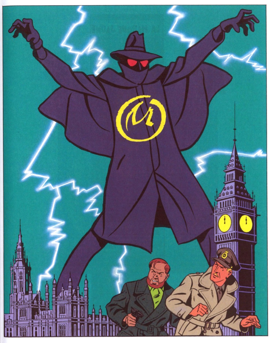
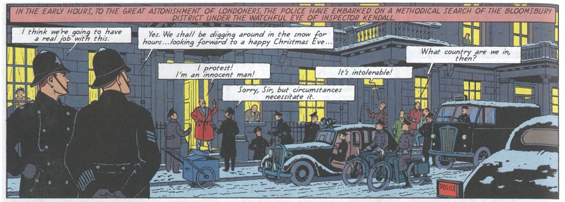
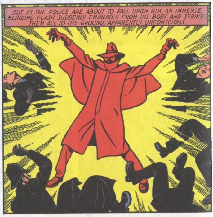
Tom was ‘amazed by the amount of real estate’ that Jacobs packs in, and remarked that he was immediately reminded of Tintin. But for all Jacobs’ obsessive attention to detail there are some glaring inaccuracies, notably the fact that everyone appears to carry guns. I rather liked this sense of unreality, though it did cause us to question whether Jacobs had actually visited England, or whether like Hergé he drew largely from books and photographs.
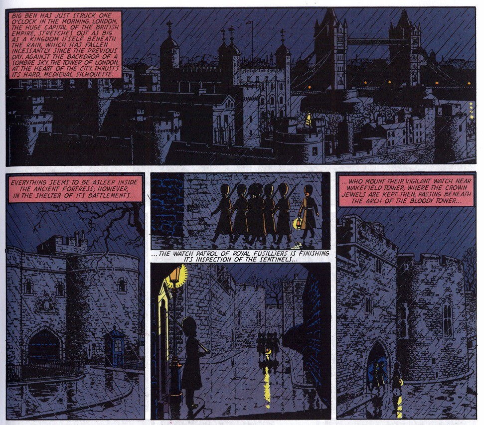
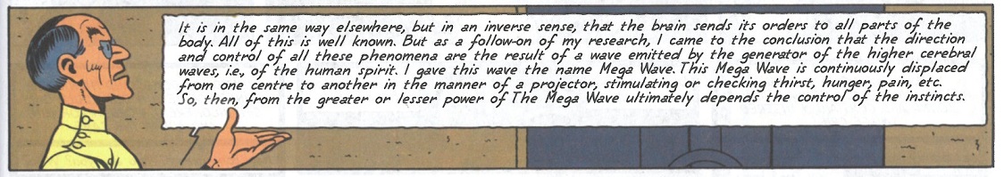
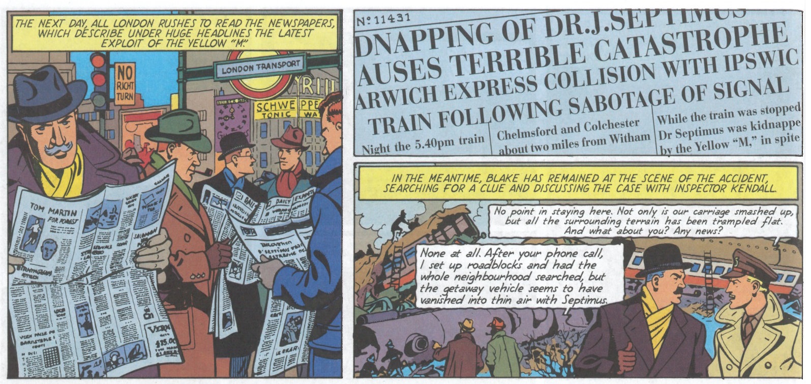
But unfortunately the art and story were hobbled by an over reliance on explanatory information, ‘every single panel has a text box.’ And some of the boxes are humongous, with massive amounts of text packed in. One particularly notorious box that runs the entire width of the page. Dan thought it was ‘typographically appalling – the insanity of that bubble!’
Tom wondered what era the story was set in. We assume the post war 1940s (which was when it was written), but much of it appeared earlier – it has the feel of a Hollywood take on Britain, a little like a Basil Rathbone Sherlock Holmes.
Tom’s verdict: 3 stars. ‘It sent me back to my Tintin books.’
Dan was the only one of us who hadn’t grown up with Tintin (or Asterix for that matter). But he was familiar with other french comics. ‘I loved the format. After reading so many comics in digital it was just fantastic to have this A4 book in my hands’. The look, shape and feel of the Yellow M sent him ‘back to France on holiday in 1984. Dad would always let me choose a Bande dessinée (French graphic novel) when we were camping, enjoying but only partly understanding’.
He thought that Jacobs was more of a draughtsman than a storyteller. The narrative was ‘like driving on a very straight road with no diversions.’ Although nobody was quite sure if he’d chosen the right route before leaving.
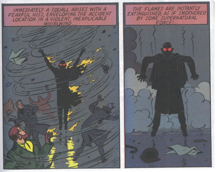
Dan found one scene particularly objectionable. In one of the kidnappings that pepper the story the dastardly Yellow M causes a horrific collision between two trains.

Dan’s verdict: Two stars. ‘It made me want to go camping in France and read some weird comic books with my daughter.
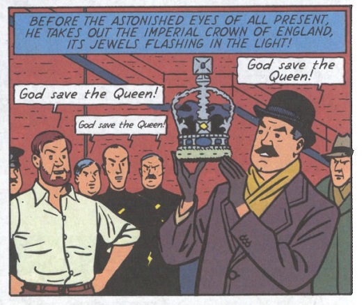
Kelvin: After the initial excitement of the crown jewels heist that opens the story Kelvin found the Yellow M a tiring read, ‘seven pages took about twenty minutes. I’d read an entire 22 page modern comic in less time.’ He wondered why Jacobs chose to lead with a daring robbery, and a lot of talk about similarly audacious escapades, but then failed to follow up on this, instead detailing the less exciting kidnap plot.

He thought the characters were very two dimensional and hard to relate to as heroes. I agreed, noting that there weren’t too many comic book heroes who sported underbeards like Mortimer’s. But Kelvin loved the artwork which he thought was ‘clean and crisp, really pleasing.’ It reminded him of the Hernandez brothers Love and Rockets with it’s incredibly clean lines. Tom compared it to Chris Ware. I mentioned that this was a specific style developed by Hergé and Jacobs, called ‘ligne claire’ (clear line). Everyone seemed impressed by my knowledge.

Kelvin’s verdict: Three stars. ‘It’s not quite Tintin.’

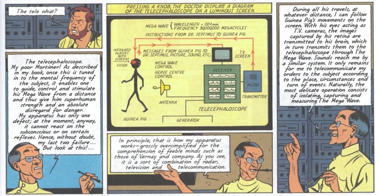
There wasn’t much more for me to add. I also found the book far too wordy, but being a fan of ludicrous mid-century science fiction I rather enjoyed the villain’s lengthy cod-scientific explanations.
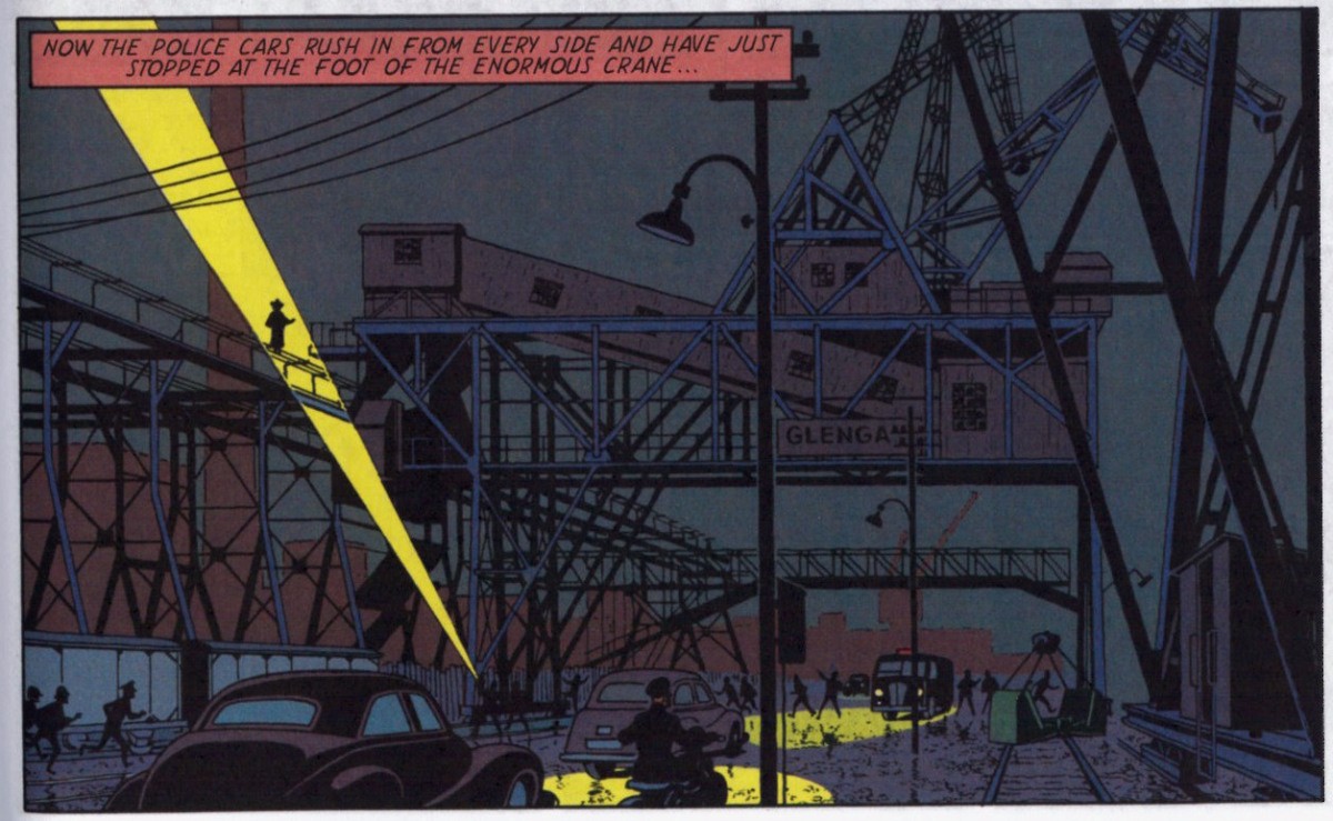
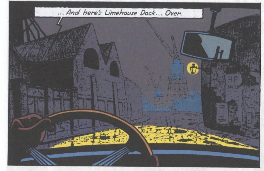
It was the action sequences that carried me through, particularly the terrific chase through the streets of the East End into the docks of the East End. The atmosphere, lighting and pacing is as good as anything in Hergé – if you can get past the ever present text boxes that is.

My verdict: Three stars. Although Blake and Mortimer wasn’t quite the successor to Tintin that I’d been hoping for, it was fascinating to see another example in this beautiful style. For all its faults I will be looking out for more from Blake and Mortimer.
Everyone else left wanting to go back to Tintin. Poor Edgar Jacobs, destined forever to live in the shadow of another man’s creation.
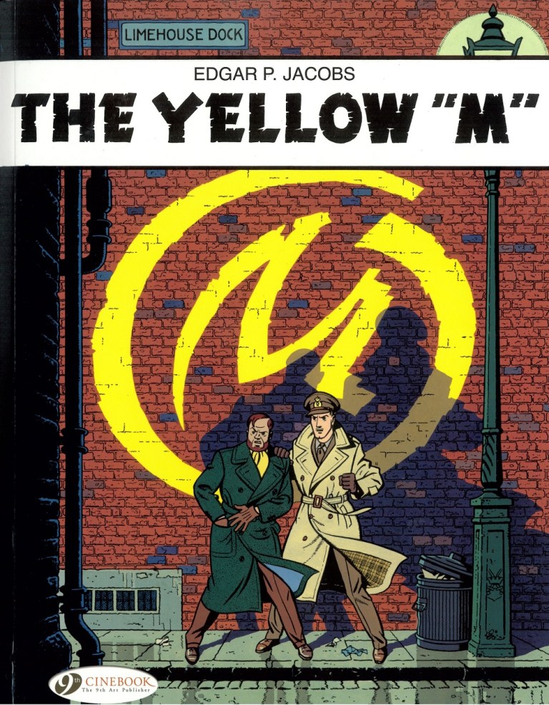
Blake and Mortimer – The Yellow ‘M’ by Edgar P. Jacobs is published by Cinebook. Follow @dacomicbooklub on Twitter.


I remember you mention Edgar Jacobs in a previous post; from all the comments it sounds as if I’ll have to choose my own personal entrée to Jacobs carefully. Great draughtsmanship though, I agree!
LikeLike